Sometimes, ‘simple’ says it best. Any rendition of the Madonna and Child speaks volumes on its own. The given presentation needs little in the way of adornment. Mother… Madonna and Child is more than enough. This was the approach in mind when designing the following quilts.
Based on a triptych (3-paneled screen) painted by Flemish artist Melchior Broderlam in 1395. It’s part of a larger altarpiece from a Carthusian monastery in Dijon, France. Various scenes are presented… the Annunciation, Visitation, Presentation, and Flight into Egypt. The right-side panel shows Mary mounted on a donkey, being led away by Joseph. The Christ Child is cradled close in her arms, partially covered by her cloak.
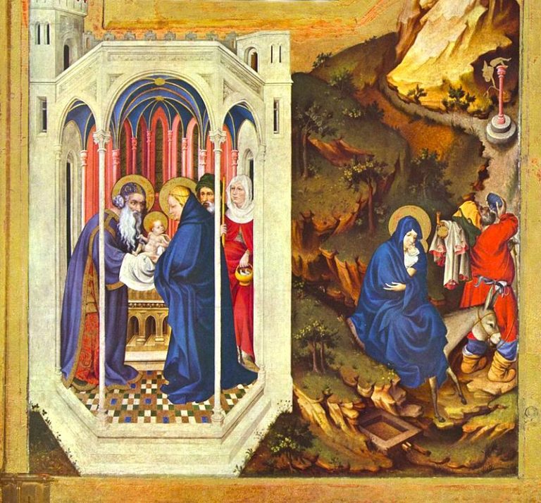
It was this latter scene which caught my attention because of its simplicity. This was the first quilt of my own design, and seemed a good match for a beginner’s skill. A plain, but eloquent presentation by Broderlam, it would translate nicely into a fabric-based piece.
This initial rendition was done as a study in contrasts. Deep, heavy colours against a much lighter background. The idea was to applique Mary, who is cradling her baby, onto one large piece of fabric. And embellish the background with very detailed, intricate hand-quilting. Similar in style to what is known as ‘whole-cloth’ quilting. The border would repeat these same colours, pieced into a traditional ‘Flying Geese’ pattern, whereby triangles literally chase each other around. All of which seemed very apt, given the name of the original painting… ‘Flight into Egypt’. It segued very nicely.
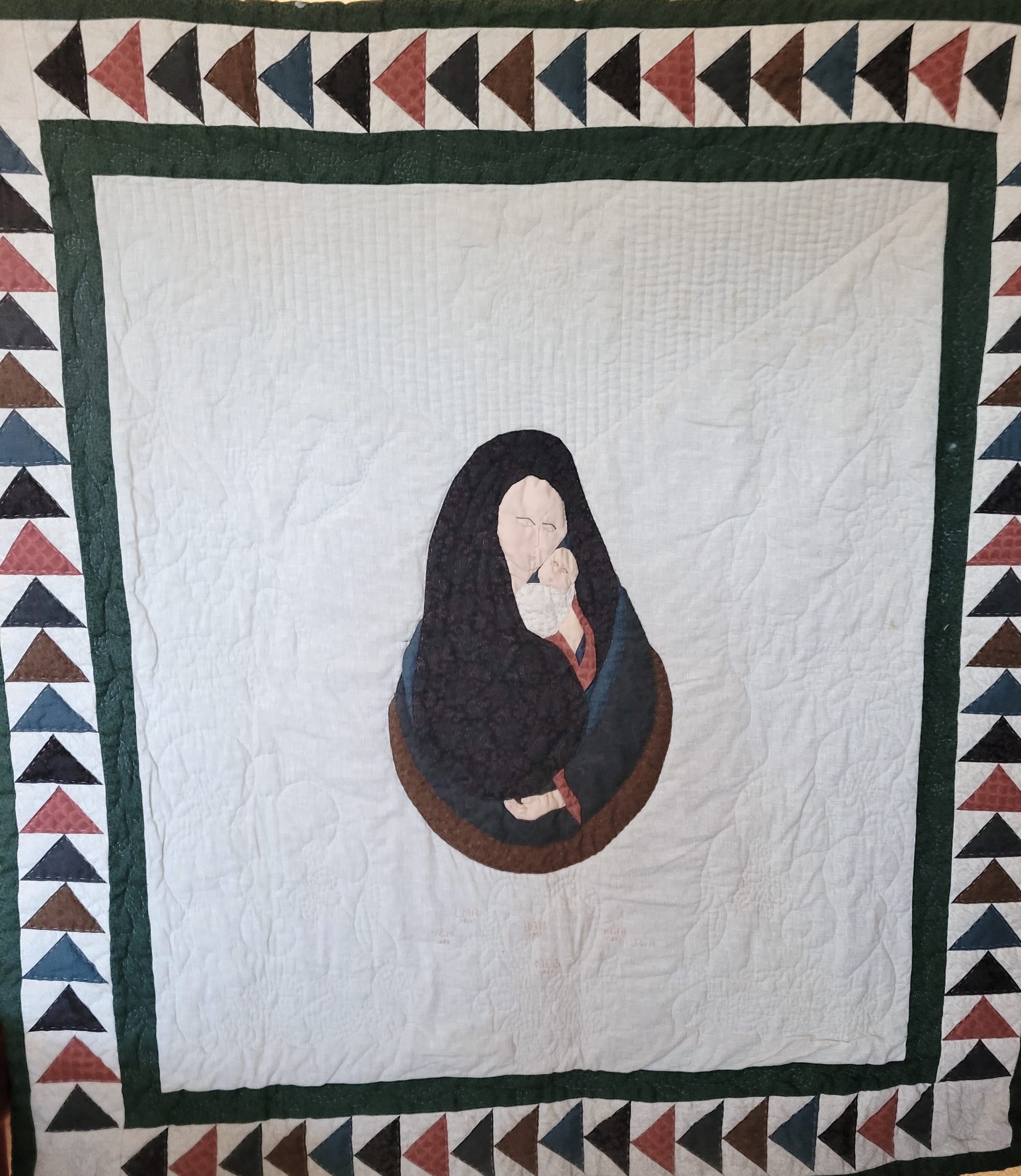
I enjoy incorporating different layers of symbolism into my quilts. If the border was going to ‘match’ with the name of the original painting, what else could be done to give some added meaning? And so, the Madonna and Child were sketched into a pear-shaped presentation. When carrying a child, a woman’s womb is similar in shape to that of a pear. This provided an additional layer of depth to the central theme. Straight lines could be hand-quilted around Mary’s head, emulating rays of light like a halo. Yet more symbolism with which to enhance the piece.
One of the attractions of Broderlam’s depiction of Mary and the Christ Child was the lack of heavily detailed facial features. As a beginning quilter, my skills were sorely lacking in this department, so that counted for something (lol).
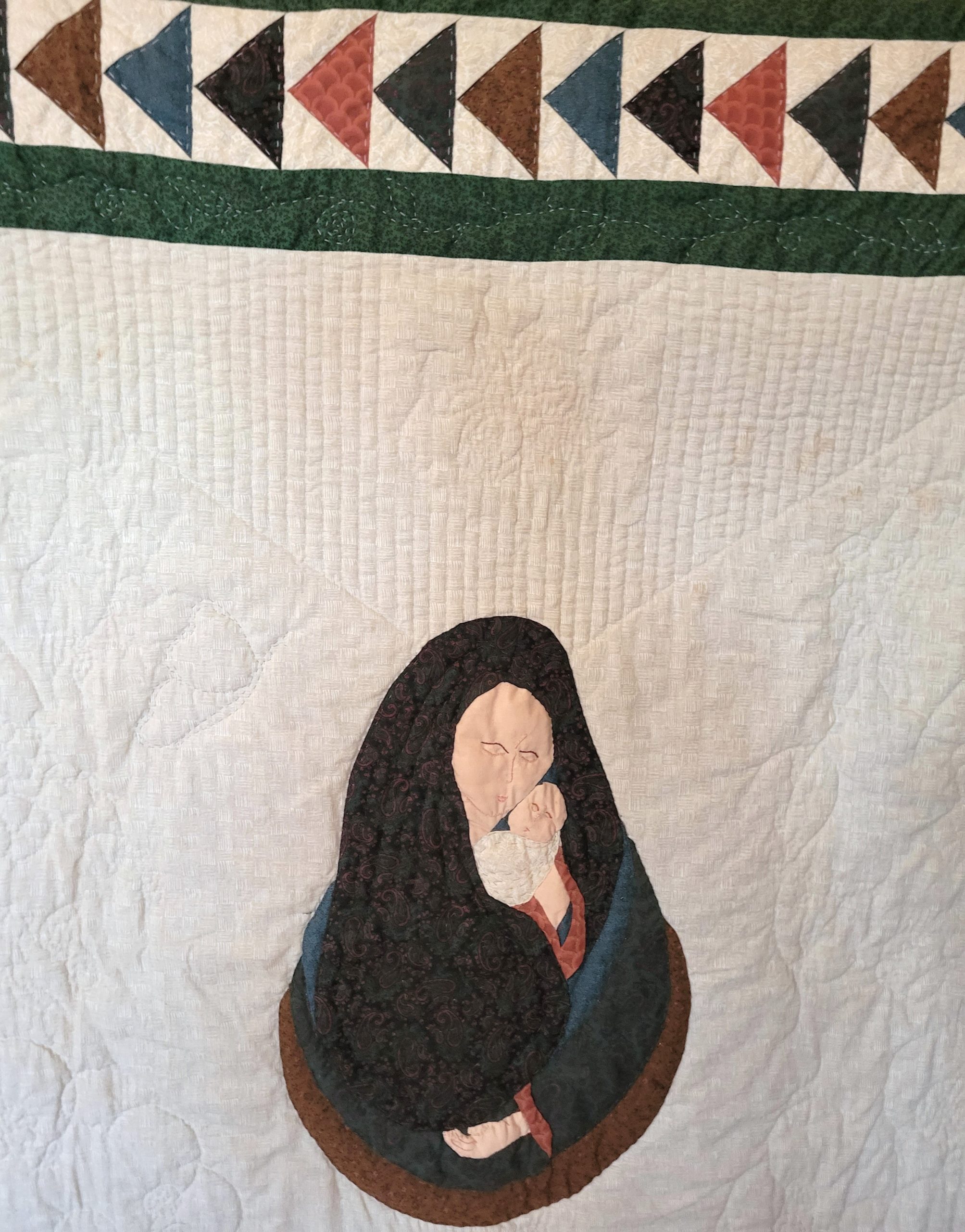
Here the facial features are lightly embroidered onto the piece, with details kept to a minimum. Same for the hands and fingers. Overall, this was a good design for a new quilter. There is so much else of note in this piece, that hands and face are the least of it. The various fabrics which make up the robe flow smoothly and freely into and around each other. And the intricate hand-quilting also draws attention.
The triangles of the Flying Geese tie the design neatly together. Such a simple presentation… and yet, such a depth of meaning. An example of how the parts work together to make up the whole.
Top-stitching with a machine satin-stitch, serves to outline the different fabrics – even as it ties them together as one. And of course, the entire piece is wrapped with a detailed and delicate hand-quilted design of swirling vines, leaves, and flowers.
But wait a minute!
What happens when you change things around? Not necessarily the design, which made for a good springboard. So… how about colour? What happens when you play around with the palette a little bit?
The previous deep, heavy colours now become lighter… brighter in hue, with tonal patterns added, instead of staid, solid fabrics. Autumn colours of burgundy, rust, topaz, and orange are used. The tonal’s infuse the design with touch of gold sparkle. A welcome contrast to the plain, white on white background.
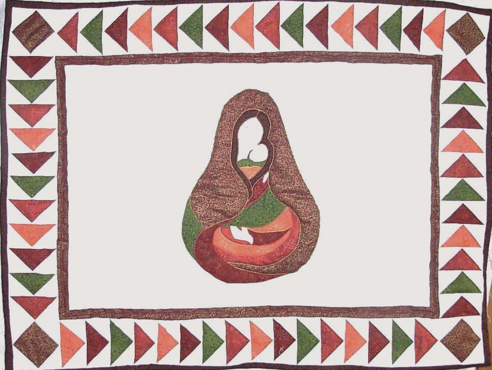
This background piece is reduced in size, allowing the focus to center more on the Madonna and Child. Otherwise, the design and presentation remain the same. And yet… it’s different… an entirely new quilt!
However, when one thinks of the Madonna… blue is the colour which generally comes to mind. Oftentimes down through the centuries, this is the colour traditionally associated with Mary.
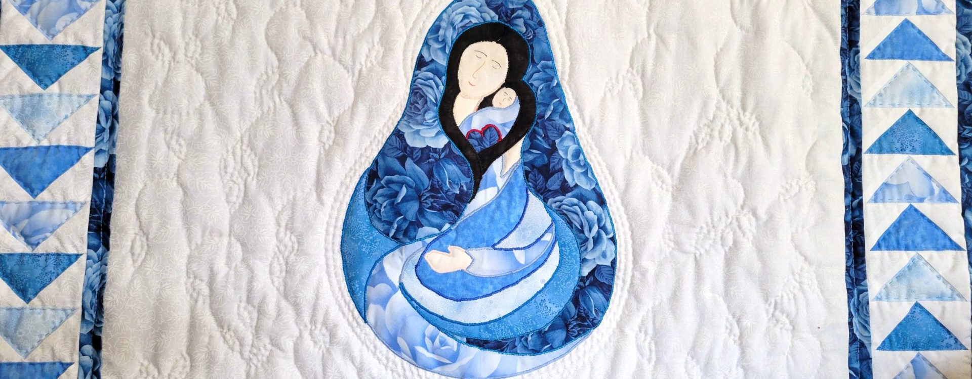
So… what would this same pattern and design look like in a blue colour palette? I got a little curious…
How about shades ranging from a dark blue tonal in a rose motif, all the way to a light sky blue.
Re-interpreting the design yet again.
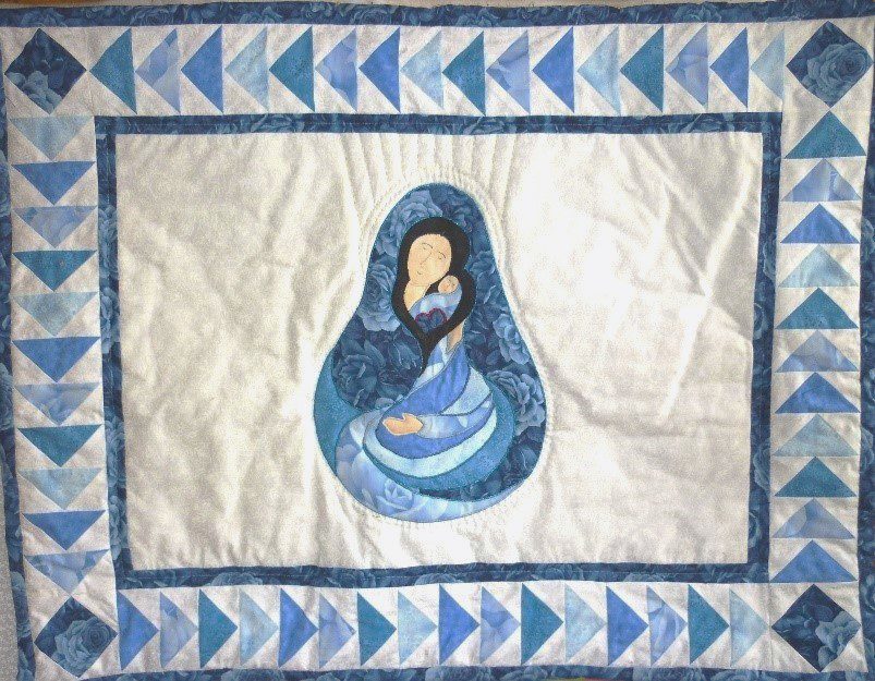
The quilt has changed dramatically since the original… offering a still, more brighter feeling with far more warmth. It maintains the integrity of the original piece, yet continues to carry out the intent of presenting a contrast of colour, while allowing the Madonna and Child to remain as the centerpiece.
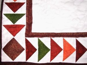
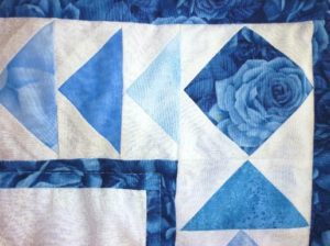
A closer glimpse of the two borders… same design… a whole different world of colour. Flying Geese chasing each other round and round!
Look carefully now at the two Madonna’s. They have ‘evolved’ a little over time with each new rendition and interpretation.
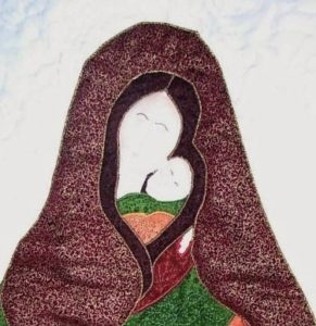
Notice the shape of the heads… mother and child together. Mary’s hair falls around, enclosing them both in what vaguely resembles a heart design.
Look closer at the orange robe piece, below the baby’s face on the left. Another heart!
Same presentation in the blue version. Only here the heart shapes are a little more developed. And further delineated with contrasting red embroidery.
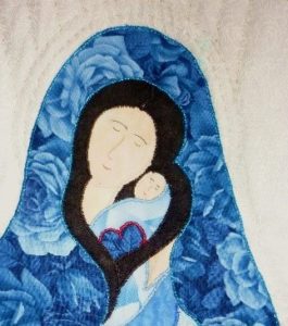
All threads used were metallic in nature. This gives a little ‘sparkle’ to the central design, setting it apart from the simple cotton fabrics. A quiet, subtle way of enhancing the loving connection between mother and child. Adding further depth to the quilt’s main theme.
Facial features are now drawn with archival-based pigma pens, allowing for greater accuracy and detail. This replaces the embroidery method used in the original piece.
However, we’re not finished yet.
What happens when you take this same design and shake it up a bit?
This time using a virtual rainbow of colours! Tradition is fine and good, but sometimes it’s fun to think outside the box. The ensuing results can look amazing!
This particular version was made for the movie, ‘Christmas Wedding Baby’.
A delightful romantic drama, written and directed by Kiara Jones of Culture Films.
Kiara is an acclaimed, award-winning writer/director. An extremely talented artist… and a joy to work with.
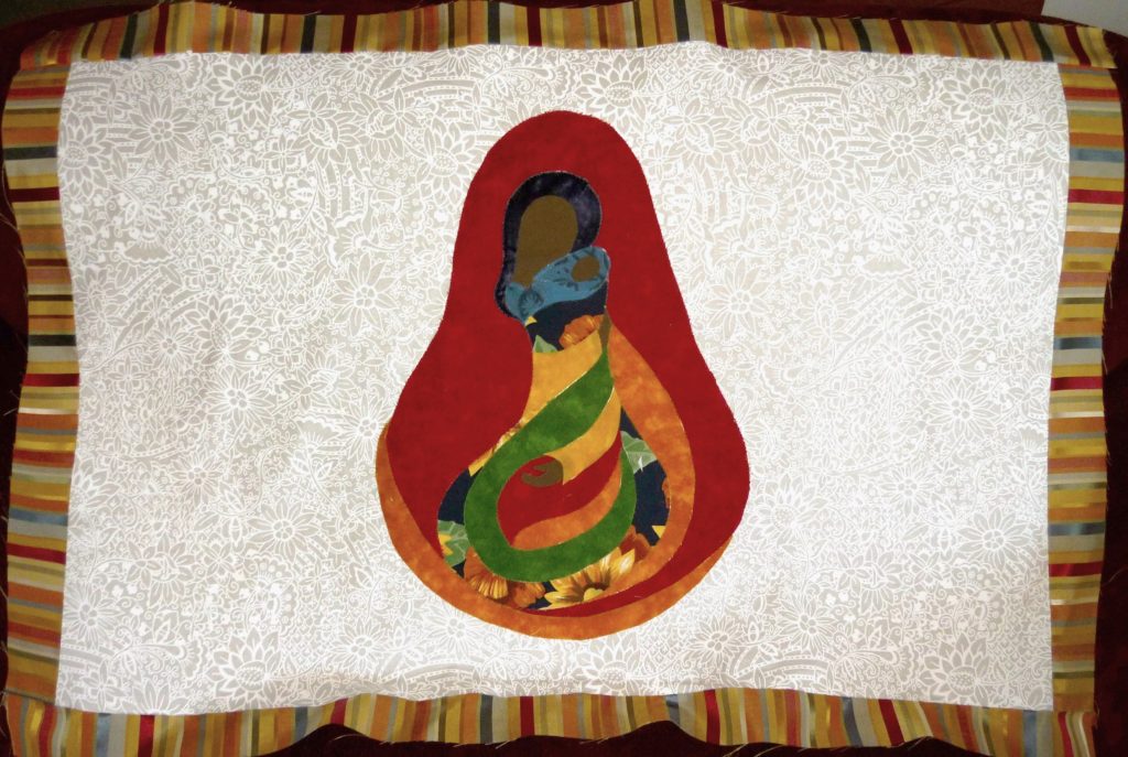
This is the same design as previous… same contrast in colour concept. And yet, the change in palette takes this rendition to a whole new level! The colours aren’t just sitting there quietly – they jump out and call to you! Drawing attention to the Madonna and Child in a bright new way. Because the movie takes place in Florida, there is a tropical feel which presents as warm and sunny. The main fabric is a white tonal just like the others… white design swirled onto a white background. The photo here shows this better than the previous ones. Pure cotton fabrics were used, except for the striped material which was satin-based. This shine made for a distinctive touch and lovely contrast. Not what you would expect to see.

As with all these Madonna ‘variations’, the piecing process remains the same. Fabrics are cut into shape, adjusted into place, and then ironed onto the background. It comes together piece by piece, similar to that of a jig-saw puzzle.
Top-stitching with a machine satin-stitch adds further form and distinction. The better to enhance the overall design by tying the separate fabric pieces into a single whole. This makes a big difference to the presentation, giving it a more complete and ‘finished’ look.
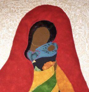
Once again, we see the ‘heart theme’. This time in bright purple, to better stand out from the baby’s blue swaddling. Notice that blue shade – very different in hue from the surrounding colours. Emphasizing the presence of the Christ Child, clothed and wrapped within his mother’s cloak.
The Flying Geese border frames the Madonna and Child beautifully! Picking up on the colours from the satin striped fabric. The large green squares at each corner help to tone down the brighter shades. Allowing the eye to ‘rest’ from all the lighter, surrounding colours. It offers balance.
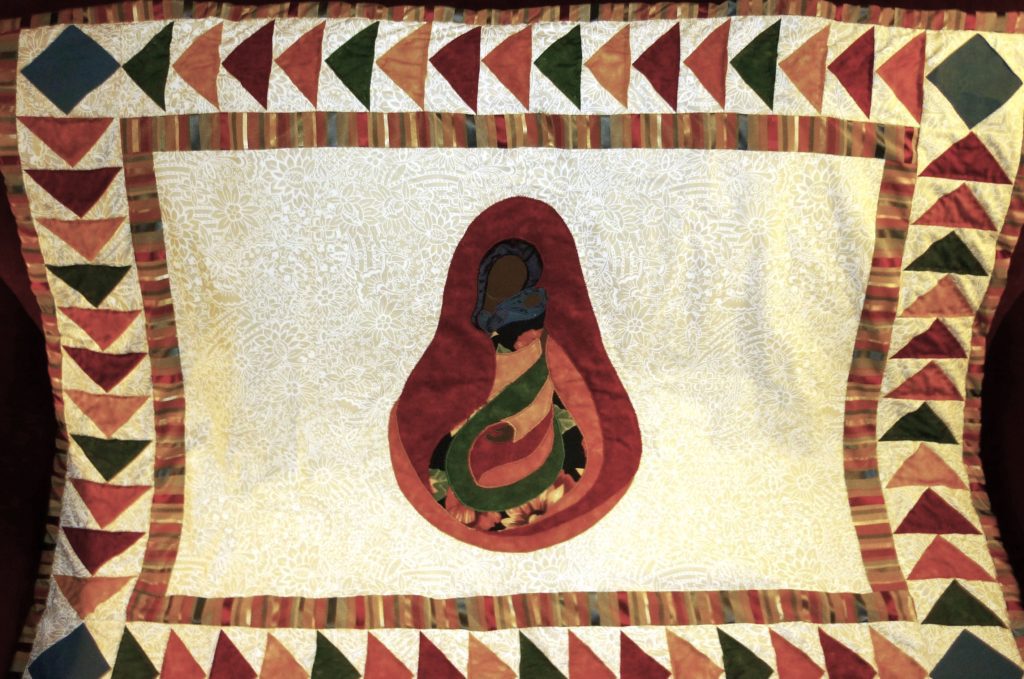
All good quilts have a certain balance to them, even when asymmetrical in design. Sometimes this is so subtle, it registers only subconsciously. The colours have to match, and yet also contrast at the same time. Fabrics need to coordinate in texture, even as differentiating them from each other can help emphasize a special aspect of the quilt.
There are many variations possible of any one given design…
a part of the beauty to be found in quilting!
2 thoughts on “Madonna and Child… Variations on a Theme”
How fun this was!!! Thanks, Bev!
It was fascinating for me to see how each version evolved over time… and with ‘practice’. What I don’t know about piecing triangles after this – isn’t worth the knowing! LOL
Comments are closed.